La Cisterna
Bottega del borgo
Website redesign for La Cisterna, rebranding, SEO content and a mobile-first UX

The project
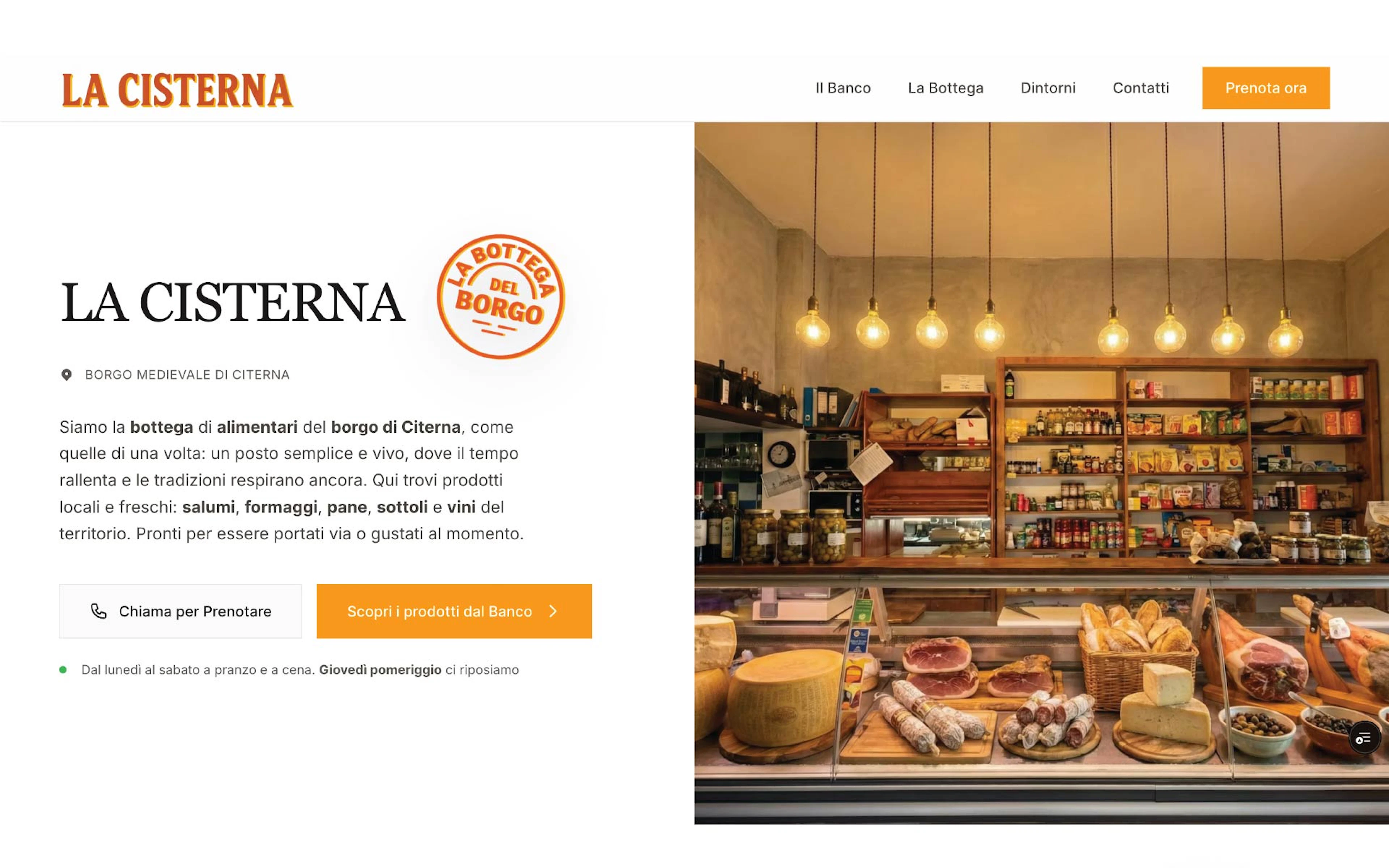
La Cisterna isn’t “just” a restaurant and it isn’t “just” a deli. It’s a hybrid: a small-town shop with a counter where you choose products and dishes to buy or enjoy on site.
The challenge was to make this concept clear in a few seconds, especially on mobile, and turn visits into real contacts.
La Cisterna, not quite a restaurant
La Cisterna is one of those businesses that, if you try to describe it with a single label, you ruin it. It’s not just a deli and it’s not just a place to eat. It’s a hybrid: the idea of a small-town grocer with a lively counter where you choose products and dishes, then you either buy them to take away or enjoy them on site.
The project starts here: building a website that explains this in a few seconds, especially on mobile, and turns interest into real action.
The counter as the protagonist
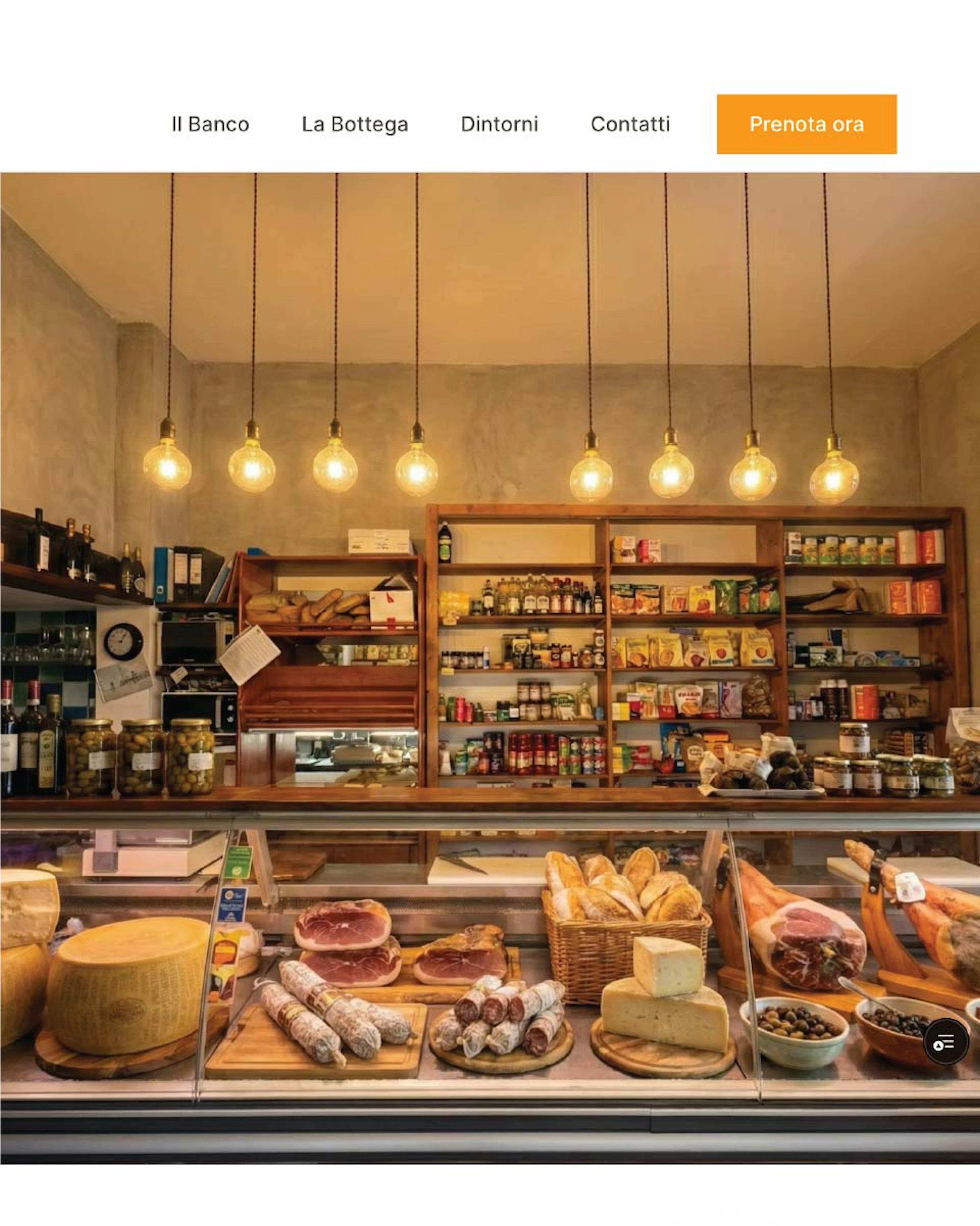
The solution is to stop presenting La Cisterna as a venue with a menu and start presenting it as a counter with choices.
The counter is the physical interface of the experience: you see, you choose, you ask, you assemble. The website had to do the same.
Useful guides that bring the right people
The Surroundings section was designed to capture real search intent and bring in people who are already nearby or planning to pass through.
Two pillars:
Valtiberina villages
Guide articles about nearby towns. Descriptive, practical, indexable content. The goal is to be found when someone searches “what to see” and “what to do” in those places.
The Way of St Francis
Here the intent is even clearer: people searching for stages and stops along the route are planning a break. The dedicated page works as a guide, framing Citerna as a stop and connecting immediately to the practical reason to pause: eat well, take a breather, then get back on the road.
Project output
The result is a complete foundation designed to grow:
- A clear positioning: “The Village Grocer”
- Essential page architecture
- An SEO content strategy
- A direct, frictionless booking flow
- Visual direction consistent with the identity
My methodology
I design products and experiences starting from people, not features.
I move from research to delivery in clear steps, so every decision is traceable, tested and connected to real needs, not just aesthetics.
Discover
Understand the context
Define
Frame the problem
Develop
Explore, test and refine directions
Deliver
Make it real

